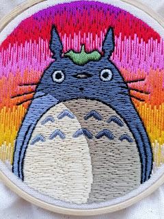
It was also my first time blending colours (or at least in a big way), which I used for the background. Again, I thought this was going to look terrible so almost gave up midway through as I didn't have the confidence that it would look any 'good'. Despite this, I forced myself to persist, because it was a technique I had been wanting to try and if I never try it, then how will I ever know if I'm able to do it?! And how will I ever progress my work? If I persist with it, then at least I can pick up what I need to improve on for next time round, rather than never try it and stagnate my progression or skill. Something I feel can (and should) be applied to all aspects of my life and work.
I think the blending looks fairly decent (more emphasis on 'fairly'), though I have found some areas where I feel it needs improving. But I do like the colourful contrast of the background to the limited palette of the foreground. I think it really makes Totoro stand out, whilst adding a little bit of 'something' so it doesn't look too plain.
I have a pretty ambitious idea for my next embroidery, so keep your eyes peeled for that one..! In the meantime, here's a few images of the design I've been writing about here:


No comments:
Post a Comment