Monday 25 July 2022

'Bear' Update 25/7

Hey hey! How’s it going? Yes, you’re quite correct, there was not one off these last week due to having a holiday- now how about that! We (partner and I) had a wonderful week on the South Coast near Worthing (and beyond) for some architecture gazing, walking and of course, watching football (including a couple of the Women’s Euros games #ItsComingHome)!

Me and Ben on Worthing Pier

Before I bore you all with any more holiday snaps, I’ll get on with writing about what we’re really here for- an update on ‘Bear’.

I’m still getting on with the backgrounds and the colouring. Some of which are taking a while due to the complexity (there are moving parts like doors to contend with), though I feel on the whole, progress is being made- quite a few large and important sequences are complete and a few are near complete bar a logistical problem or two!

Despite the progress, I did have a little motivational crisis this week. It’s one of the first times I’ve felt like this in a big way about the project since that first week where I had a dip in confidence. I think this has happened this week because it’s at the stage where it’s nearly done yet it still feels like there are a lot of hurdles to get over (and hard ones, too) before I can say it’s complete. Some of the stuff left to do feels a little daunting, but I know I have to do it or the film won’t ever get finished. I think as well due to having been working on it since February almost non-stop and I kind of imagined I would have completed it by now, it feels a bit like I’m a fair way off being able to carry out the other creative ideas I want to pursue (including any football photography which I’ve been forfeiting for a while now, due to not wanting to lose a day of animating to editing the photos).

In addition to the above, I know I won’t have the film finished by my original 29th July deadline unless I rush parts of it (something I really don’t want to do due to having put so much time and effort into it already), leaving it a piece I’m not proud of and not the best it could be. Luckily Manchester Animation Festival (the deadline I was aiming for) accepts rough cuts/ works in progress (providing you can complete it by September), so I’ll see what state it’s in by Friday and if I feel I’ve done enough by then, I’ll send it in as even at this stage I’ll definitely be able to finish it by September. If not, then I guess I’ll have to wait another year. The ‘knowing I wouldn’t hit my original deadline’ was also a part to play towards my motivation dropping.

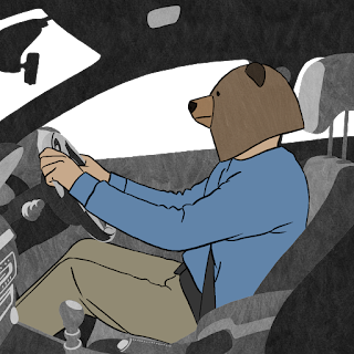
Anyway, that aside, I’ll share a behind the scenes image:


This is probably one of my favourite BTS images as it fully shows the beauty of the rotoscope medium. It also demonstrates what you can do with limited resources if you put your mind to it. Thanks to a super low budget (i.e. my own money) and therefore not having access to a proper sound stage/ studio or anything, the room I shot most of the reference material in didn’t have enough space to get this shot which I really wanted. Soooo, without willing to compromise on this occasion, I filmed it in the park where I shot some of the car scenes. And I absolutely love the result. Luckily it wasn’t really windy or anything or this shot might not have looked very realistic once comped with the background!


I think the above is a good example of knowing when not to compromise in indie filmmaking if you’re able to make it happen in a DIY fashion. This is another reason why I absolutely love rotoscoping, because it feels you can do pretty much anything with the medium, whereas in live action, it might not be possible without a huge budget, a crew, lighting, sound and a super producer who can obtain all those locations you need on the budget you have.


See you in the next one xo

Saturday 23 July 2022

35mm Photography

In early June, I treated myself to a 'new' (second hand/ pre-owned/ vintage/ insert preferred term here) 35mm camera:

What a beauty!

I've used film a lot over the past 11 years (you can scroll back down the #photography tag on this blog to find some of my earlier stuff if you're so inclined), but have given up 35mm cameras at several points in my life due to various reasons including lack of money and not making/ having the time to pursue working in the medium.

For the last year or so, I've had the urge to get back into it and I finally bit the bullet and purchased a camera I very much used to enjoy using way back when. And so far I've loved using it this time around too, though it might take a while to really get to grips with it again and get to know the camera and what settings to use etc.

One thing I was not expecting though was the incredible rise in both costs of film and film processing. I shouldn't have been so naive. Besides this, it's been really fun using a film camera again and I can't wait to keep improving my photos.

Here are some which I liked from the first roll. Classic cars and architecture- what's not to like!


Sunday 10 July 2022

Background Style/ Project Update

A late post, I know, I know. I just felt I was far too busy to stop working on the backgrounds/ project in general to type this thing out. But I assure you, I am still working hard on ‘Bear’!

I bet you want to know what background style I’ve chosen then? Well read on…

I decided to go for a fairly minimalist take on things for several reasons. The first being the pressure of time- if I went for a super complex style, then the likelihood of still working on the backgrounds at the end of the year would be very real. And something which I definitely do not want. A finished film is always better than an unfinished film, however ‘great’ the unfinished film might be, hypothetically, of course!

I also wanted to do something within my skillset. My primary skills lie in rotoscoping and are very character focussed, rather than anything else. Usually my backgrounds (when I do them) are more impressionistic/ abstract, so I wanted to carry that across into this film and despite it being a more advanced piece in terms of story, I still want it to reflect who I am as an artist/ filmmaker. I didn’t want to make really clean looking backgrounds, because that wouldn’t be playing to my skillset and I’m probably not the best person to carry that out. Maybe that’s for when I make a film with a budget. All eyes on you, funders!

If you remember back in January I actually posted about some potential background styles. Before starting the animation process, I was convinced that those were the style I’d go for, but as I got further into the project, I felt they’d be too complex to reproduce for each background in the time that I have. I really liked the textured aspect to them, which I kept for the current backgrounds, but everything else was kind of scrapped. I also created them in Procreate- a wonderful drawing app, but personally I find it difficult to animate in, so if I were to use the same continuity in bushes etc for the parts which needed to be moving such as doors opening, then that would have posed a problem. So I needed to find a way of making the backgrounds in TVPaint.

After deciding to scrap my original ideas I was a little stuck to be honest, but I then watched several short animations to get some inspiration going and that definitely worked! It always does, I find. I’m always super inspired after coming back from any form of animation festival or short film screening. My favourite place currently to source quality short animation online is the YouTube channel BANG BANG which you should all go check out (right after reading the rest of this post)!

I stumbled upon several shorts which utilised black and white/ greyscale backgrounds and thought that could be a good way forward.

My designs evolved from something really clean and graphic (which I almost went for, but deep down I knew something wasn’t quite ‘right’) to something similar, but with texture and something which suited the style of the film much more. The added texture softened the whole image and was much more pleasing to look at. I also like the fact it didn’t look as ‘clean’ as the original idea. You can see the evolution of my designs here:


The middle style was at first the design I decided to go with, but then as I created more backgrounds for the project, I was finding the two-tone idea quite limiting and I didn’t think the backgrounds were looking ‘good enough’ or at least complex enough for what I wanted to achieve with my film. I also disliked the amount of white space in them. I then decided to still use the same concept, but in a more greyscale way as you can see in the third design. I am much happier with how these are looking. I feel as the designs are somewhat ‘closed in’ and perhaps even claustrophobic feeling, they definitely suit the tone of the film. The style is quite dark, emulating what the character is going through, throughout. They are minimal, but have more than enough detail for the audience to tell what room or setting he is in. They are still pretty much as time efficient to carry out, too.

I’ll leave you with this little clip, so you can see what it all looks like when its moving: