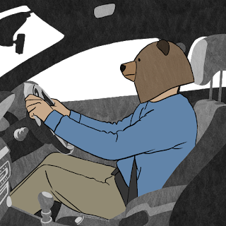
I bet you want to know what background style I’ve chosen then? Well read on…
I decided to go for a fairly minimalist take on things for several reasons. The first being the pressure of time- if I went for a super complex style, then the likelihood of still working on the backgrounds at the end of the year would be very real. And something which I definitely do not want. A finished film is always better than an unfinished film, however ‘great’ the unfinished film might be, hypothetically, of course!
I also wanted to do something within my skillset. My primary skills lie in rotoscoping and are very character focussed, rather than anything else. Usually my backgrounds (when I do them) are more impressionistic/ abstract, so I wanted to carry that across into this film and despite it being a more advanced piece in terms of story, I still want it to reflect who I am as an artist/ filmmaker. I didn’t want to make really clean looking backgrounds, because that wouldn’t be playing to my skillset and I’m probably not the best person to carry that out. Maybe that’s for when I make a film with a budget. All eyes on you, funders!
If you remember back in January I actually posted about some potential background styles. Before starting the animation process, I was convinced that those were the style I’d go for, but as I got further into the project, I felt they’d be too complex to reproduce for each background in the time that I have. I really liked the textured aspect to them, which I kept for the current backgrounds, but everything else was kind of scrapped. I also created them in Procreate- a wonderful drawing app, but personally I find it difficult to animate in, so if I were to use the same continuity in bushes etc for the parts which needed to be moving such as doors opening, then that would have posed a problem. So I needed to find a way of making the backgrounds in TVPaint.
After deciding to scrap my original ideas I was a little stuck to be honest, but I then watched several short animations to get some inspiration going and that definitely worked! It always does, I find. I’m always super inspired after coming back from any form of animation festival or short film screening. My favourite place currently to source quality short animation online is the YouTube channel BANG BANG which you should all go check out (right after reading the rest of this post)!
I stumbled upon several shorts which utilised black and white/ greyscale backgrounds and thought that could be a good way forward.
My designs evolved from something really clean and graphic (which I almost went for, but deep down I knew something wasn’t quite ‘right’) to something similar, but with texture and something which suited the style of the film much more. The added texture softened the whole image and was much more pleasing to look at. I also like the fact it didn’t look as ‘clean’ as the original idea. You can see the evolution of my designs here:
I’ll leave you with this little clip, so you can see what it all looks like when its moving:


No comments:
Post a Comment