Monday 31 January 2022

Analogue Backgrounds

This piece was technically the second piece I made in Callipeg, as I did the outlines not long after I created my first piece back in December. After creating a quite experimental/ loose animation as a self introduction to using the app, I wanted to trial it in a more practical sense, i.e. creating clean roto outlines which are quite common in my work, resulting in this:

The outlines (frame 1)

I was pleased how nicely the outlines came out, but I wasn’t particularly sure how to finish/ colour the piece. I hadn’t long since done a quite clean EbSynth piece and I didn’t want to do hand shading like I did in my first Callipeg shot either, because I was really trying to vary what I was creating.

So I just left these lingering around for a while, hoping I’d think of an interesting way to finish it. Usually if I’m stuck on a piece, I tend to leave it (unless I have an impending deadline), start something new and come back to it with fresh eyes and fresh ideas. If I don’t have a time pressure, I find working like this is usually a good system for getting things done, for me at least.

Two pieces later, I thought it was time I came back to this one- it was hanging over me and I wanted to get it finished! I really liked how the outlines looked and I wanted them out in the world (and out of my head)!

After watching the clip through, I thought, well why don’t I just do something quite experimental with this one? After all, I’ve had the outlines for ages so I might as well just go for it, whatever ‘it’ was. I then decided to print out the first 4 frames, to experiment/ doodle all over to see what comes up. Getting out the pens and paper is always a good inspiration starter for me! I love how you can go from virtually zero ideas to several in the space of around 20 minutes after a little bit of scribbling/ mind mapping.

I started jotting some ideas down, though they were still quite ‘safe’ and not really going anywhere. That was until, over lunch I was scrolling YouTube and decided to watch a suggested video on the MoMA channel on the artist Sophie Taeuber-Arp. I hadn’t previously heard of her, but the thumbnail looked like it might be art I’d enjoy, so decided to give it a watch. Here it is below:


And I really liked what I saw. So decided to use that as my starting point: abstraction. Start with one shape or colour and see how far I can take it, changing a small section each time. That was my starting point, though I ended up straying from that thought, once the ideas came flooding.


As you can see from the above (the first 4 frames), I was initially going to colour the character as well in an analogue way. This changed as I went, because I thought while I focus on the backgrounds, I’ll leave the character and do him afterwards. Though as I was going along, I decided that I’ll actually do the character using fairly flat colours in TVPaint, so it would act as a nice contrast with the hand rendered backgrounds. Looking at the end result, I feel this was a good decision.

I decided to use pens (biros, felt tips, Sharpies, Pro Markers) as the medium, because a) I have a huge box in my room left over from my animation workshop I did in September and b) the medium is a quite quick one to work in, so I can get my ideas down without having to wait for anything to dry etc like I would have if I were using paints. The colours are also really vibrant using felt tips which was good for the bold, block colour shapes I wanted to create.

Once I was happy with them (66 frames in total), I scanned them in and placed each behind the corresponding outline for all the frames in DaVinci Resolve (I’ve moved from Adobe [all but PS] because of the absurd subscription prices). I then exported a PNG sequence of the backgrounds and brought them back into TVPaint where I finished colouring the character.

Like I said earlier, I didn’t want to do a full EbSynth piece, but the flat colours were looking too plain. So I did a hybrid: I made a pastel-looking style frame in Procreate for the hair, which I ran through EbSynth and for the rest of him, I combined the original footage (after applying several effects to in in TVPaint) with flat colours. This had some elements of the ‘real’ look, yet I boosted the flat colours enough, so it didn’t look too strange/ creepy/ uncanny valley. The real footage showing through is very subtle, though more noticeable on the face, which is a nice touch.

Left: the altered live action footage Middle: the plain colours with Procreate styleframe Right: the final character composition

Overall, I do like what I’ve created here and I especially love the backgrounds and the contrast between the clean, computerised look of the character. I think to improve it though, I would have preferred to have taken the live action footage frames into Photoshop and manipulated them a little further, like I did with some previous experiments here and here. It’s just that TVPaint doesn’t have as much choice of filters as Photoshop does, so I didn’t quite get the effect I fully wanted. But my Photoshop is super slow and crashy (either the fault of Adobe or my old computer, but probably a mixture of the two) and I honestly couldn’t be bothered to spend the day waiting for a piece of software to decide whether it wants to work. So I left it as it was!

Here’s the clip:

Wednesday 19 January 2022

Tennis

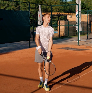
Tennis seems to be in the news a lot lately, but that was legit not the reason I decided to choose to animate this next clip! I actually selected it because I like animating sports/ footage with a nice amount of action in, plus I loved the movement of him serving and the shadows it created (both on the floor and across his body).

Grab from the clip

I wanted to find a style that would not only do the aforementioned movement and shadows justice, but also set it aside from my other work in terms of style. I also wanted it to contrast with my previous two Callipeg clips and try something different (if you have only just become a regular reader of this blog, you’ll soon start to realise that I try to make each piece differ from the previous- I’m a geek like that, I just love learning/ developing)!

I was really tempted to go for clean lines again, but then I was like well my last clip was clean lines so why would I entertain doing the same? Or the same right away, anyway? I appreciate going back to a style you love (it’s the done thing in art, right?) and I do this myself often, too, but I’ve got a short film coming up which I’m animating all in one style, so I decided that this period leading up to that will be a time where I can free myself up a little and experiment. You know, get all this stuff out of my system now, before I can’t change my style for several months whilst animating my short!

So, looking through my work, I was thinking what haven’t I done much of? And what would I like to try or develop more? I really liked my first Callipeg animation in how loose/ scribbly it was, so decided to take that one step further.

I decided to use similar sketchy outlines, though this time used the brush rather than pencil tool, so there was a hard edge to my lines rather than a textured one. I then filled in both the shadows (the cast shadow and the one sweeping across his body) in the same scribbly way. Now, here’s where I almost gave in to temptation- I thought, well you know, I’ve experimented quite a lot already, now can I just play it safe and fill the inside of the figure cleanly?

Scribbly outlines

Here, I almost cracked. I then decided that no, I’ve set out to make something different, so I’m going to make something different. I got mega stubborn on myself and decided to colour him in by the same scribbly manner. Kind of creating a lino print/ wood cut effect (a style I have wanted to emulate for a time now). All along I was worried that it might not look very good, but I guess that if I didn’t like the effect it was creating, I could just fill in the gaps I was leaving out and have a plainly coloured figure or just learn from this mistake and not do a clip in this style again. Not everything I do needs to be ‘great’ or I’ll never learn new things if I don’t try them. Also, not everything I make needs to go on social media/ YouTube (and trust me, it doesn’t)!


I finished colouring his clothing and was liking the result, but still pretty timid as it was my first time doing a full piece like this. I thought that for the skin, I’ll just fill it in plainly (just to add some differentiation I told myself). Then, I pushed through (I’m like wayyyy over dramatising this)! …and decided I was to do the skin in the same way- again, telling myself I could always colour it in fully if I didn’t like it.


Did I need to do any of that? Nope. I absolutely loved the end result and think that if I did colour any of it solidly, then it would have been a weaker piece. I think the moral of this story is to just go for it and experiment where you can, as you might like the result and if not, it doesn’t matter. Or something like that.


Once completed in Callipeg, I exported the file to TVPaint where I was to finish colouring it. I then went a little further. Why not make him a silhouette? Why not use bold and inverted colours? So I did just that and ended up liking the result even more. It also really accentuated the print style which I was going for. Win.


Then, the background- I almost just left it as a plain colour red, but my previous piece didn’t have a background, so I thought maybe I should do one for this. It might even strengthen it. I opened Procreate and messed about for a couple of hours and created a background I really liked and which further enhanced the lino/ woodcut style I was going for. 


A background I discarded


The background I went for


Despite me being tentative throughout the creation of this clip, it was simultaneously an exciting piece to produce. I hope it comes across in the end result- I like to think it does. I love how much I pushed myself with this one and the result is probably more exciting than a lot of the things I make. Doing this has really made me rethink how to approach future works and I hope that the main thing I take from creating this piece is to push myself even if I don’t think it’ll work, because you just never know…

Wednesday 12 January 2022

Latest Clip/ More Callipeg Love

Part 1: Latest Clip

Being as my last Callipeg animation was something quite loose, I wanted to contrast this by doing something little tighter/ neater.

After exploring several styles (I usually start each piece like this if I don’t have an idea for it already- drag the clip into the timeline, draw around 5-7 styleframes and pick the one I like best/ haven’t used before/ suits the clip most), I decided to go with one which really played on the interesting parts of the clip, which to me, were the shadows and the movement of her jacket. I loved the cast shadow which she created as she walked down the steps and the lovely shadows on her trousers and coat as she walked. I wanted to make a piece which really accentuated this.


I also wanted to do something I’ve not done previously and though I’ve done pieces similar, I can’t recall one which mirrors it exactly. I also didn’t use an outline on this one, to set it even further aside from any other piece. I feel this one definitely looks different than my usual stuff due to the lack of outline.


I used block colours to make each shape really stand out and only went for adding just darks when shading, rather than a highlight colour (which is what I’ve been doing on my recent EbSynth animations). I definitely feel like I achieved what I set out to, even though this clip took a lot of time! The bold shapes really enhanced the shadows and her movements and made, in my opinion, a quite striking image.

Part 2: More Callipeg Love <3

Since my last post about Callipeg, they have released a new update (version 1.8) which has come with some brilliant new features. See those in detail in the video below:


The main one I’ve taken advantage of so far is the export to TVPaint feature (you can also export to Toon Boom, Blender and AE). I utilised it in this project (so I could finish off the colouring which is what I usually do in TVP) and wow, it saved so much time- I didn’t have to export the layer PNGs separately- it did it for you and ordered them in the timeline in TVP with the right timing and everything! Doing all that manually with this project would have taken ages as there were a lot of layers!

The interface has also changed slightly (mostly in a good way), though I did find the ‘add new frame’ button so close to the ‘back frame’ button quite annoying, especially at first. When I rotoscope, I don’t draw the full picture at once- I take one line, say the shoulder for example, draw that for the full length of the clip until I reach the end frame, then pick a new line, draw that pressing the back frame until I reach the start. I repeat this process until all the lines are done. This keeps my lines consistent and feels like a quite quick process. When doing so, I have my left ‘pointing finger’ hovering over the frame froward/ back buttons which I press each time I have completed a line. I’m not usually looking at where my finger is pressing as I’m keeping my eyes on the screen ready to draw the next frame, though I would sometimes miss hit the ‘back frame’ button and add a new frame by mistake, causing the frames I have just made to offset. At first I had no idea what was going on and was like why are all my frames going out of sync?! But then I realised! Since noticing this, I'm being extra careful, but still have full on ‘back frame/ add new frame’ anxiety! Anyway, maybe I’ve just wasted about 200 words to basically say I’m clumsy, or maybe I have a point about the buttons being a bit too close! Who knows…

Also, pro tip for any other rotoscopers out there reading this- if you import a video file into Callipeg which is stored in ‘photos’ on your iPad, the video will downgrade in resolution when imported into Callipeg. If you store the video file under ‘files’ instead and import it from there, the video imports in the correct quality/ res. This is the fault of how Apple stores files, rather than Callipeg, but just incase anyone is struggling like I was at the beginning, then this is how to fix it!

Also, contrary to what I put in my previous post on Callipeg, you can delete what you have selected- all you need to do is bring up the circle menu (two finger hold) and clear the frame like you usually would, though this time it only deletes what you have selected. Thank you to the super friendly and helpful team at Callipeg for helping me with these two issues.

Around a month in with almost constant use (ask my boyfriend if you don’t believe me!), I’m still absolutely loving animating on Callipeg and can’t wait to keep creating work with it…

The Storyboard


After
writing the script, the next step (or at least for me) in my short film process was to create the storyboard. For something which was essentially ‘just drawing pictures’, to be honest, it was a little bit of a challenge.

Maybe this is because I expected it to be easier as I’m more of a visual person than a written one (wait, sorry, but you keep a fairly wordy blog?? Yes, but that’s different)! I think mainly though, it was because it felt quite relentless: there were soooo many shots/ panels/ boards (whatever they’re called in the biz) and to get what was in my head accurately down on the page was pretty tough. It was also hard to know what kind of shot might work best to visually get what’s on the page successfully to the screen without making it feel confusing or disorientating to the viewer.

The current storyboard stands at 175 panels (I think there may be a little redrafting yet to come), which feels quite a lot for a 12 page script (so approximately a 12 minute runtime). As the film isn’t going to contain any camera movements, I perhaps needed to use more shots to get some of the action across, instead of using a single camera move if the camera could be used to track/ pan etc. I’m planning on shooting the whole thing using a tripod, because it will be the simplest way to add the backgrounds in afterwards- I’m shooting in essentially an empty room, bar a few props/ furnishings, so pretty much everything else needs to be drawn in post. The most efficient way of doing this would be to not make any shots over complicated with moving the camera (or at least not until post-prod) or it’ll make my job creating backgrounds a lot, lot harder.

I know I said it was challenging at times, but despite this, I did find it quite fun on the whole. I actually ended up asking my partner Ben to pose for me (thank you) so I had an accurate reference to go off. I then comped the photos I took of him on top of other reference photographs to create a full image, which I would then draw over and fill in anything which I didn’t get on the photos. This worked really well and it felt like a really smooth process. It also helped clear a couple of things up for me in terms of logistics for the impending shoot…

I used Callipeg to draw the images with and put it together in TVPaint- it has a wonderful storyboard feature integrated in the program. Something I have only just learnt about after having been using the software for 6 years! They have several brilliant tutorials on their YouTube channel which explains how to work it.

Wednesday 5 January 2022

Background Styles

While working on the storyboard for my upcoming animated short film, ‘Bear’, I simultaneously have been working on a background style for it.

I have a quite good idea in mind of what style I’ll be using for the characters (perhaps a post on that to follow- we’ll see), though backgrounds are something I’ve often previously struggled with. I think this is because when I create clips to practise my animation, I usually focus on the thing that moves (so the character) as my intention has always been to explore animation styles, not the background.

I also used to find digitally drawing them really difficult on my Wacom (not a display tablet)- drawing on my tablet has never felt that natural, so any images which weren’t things I was rotoscoping seemed to take forever and be hard to get the strokes right. I also used to find drawing with Photoshop a fairly clunky experience, despite the amount of digital artists who do use this software. This was all until I purchased my iPad and downloaded Procreate, that drawing digitally finally just felt like drawing on paper and really natural. I wish I had known this all along!

With my new tools, I decided to create a couple of ‘test’ backgrounds. As I said I already knew what style I’ll be going for with my characters (a black outline, with the colour/ shading being quite bold/ graphic/ clean), I wanted to make the backgrounds contrast with this, enhancing the characters and making them stand out (after all they are the focus).

I want the backgrounds to clearly be ‘there’, but not distract, so something impressionistic was what I was looking to achieve. Though, not too impressionistic or abstract that we can’t see what is happening! I also didn’t want the background to include any outlines in attempt to remove it further from the character style.

After quite a lot of trial and error with different brushes (I’m very new to Procreate), I decided to use the ‘Spectra’ brush for the majority of it, with a variety of other brushes for the other elements such as the sky (exterior) and the floor/ walls (interior). This brush gave a gentle pastel kind of effect and gave me the right texture I was looking for.

I made the exterior one first, though decided to also make an interior one, to see how the look would translate on both as my film contains a variety of settings. I think the style is consistent across the two (something which I was worried about) and it definitely contrasts with the proposed character style. So I think I achieved what I wanted.

One thing I haven’t quite decided yet is how to do any props/ anything the character interacts with. An idea I have had, would be to give certain elements a black outline, so it’s more in keeping with the character, but have them coloured in the way the background is. This will act as a nice cross over between the two styles and could really work for the props. This will be something I need to experiment with first, as it will also mean doing some animation in Procreate- something I’m yet to try...

Below are the two background images.


Sunday 2 January 2022

2021 Top Film Recommendations

Like last year, here are my top film recommendations out of the (feature) films I watched during 2021. In total I watched 144 (143 being ‘new’ i.e. one’s I have not previously watched, with 1 rewatch: Richard Linklater’s ‘A Scanner Darkly’ [of course]), down from 219 in 2020 (the pandemic gave me a lot more film watching time)!

These are listed in order of which they were watched, earliest being first. There was no way I would try and order them into my favourites- that would be an impossible task!

The title of the film is in bold, followed by the name of the director(s) and then the date which it was made in brackets.

Please enjoy and let me know any recommendations of what to watch this year in the comments.

1. 
Sylvie’s Love, Ashe, Eugene (2020)
2. 
Josep, Aurel (2020)
3. 
Beginning, Kulumbegashvili, Dea (2020)
4. 
Involuntary, Ostlund, Ruben (2008)
5. 
Mogul Mowgli, Tariq, Bassam (2020)
6. 
System Crasher, Fingscheidt, Nora (2019)
7. 
Shell, Graham, Scott (2012)
8. 
Maborosi, Koreeda, Hirokazu (1995)
9. Your Name., Shinkai, Makoto (2016)
10. XXY, Puenzo, Lucia (2007)
11. 
Dead Pigs, Yan, Cathy (2018)
12. 
Fantastic Planet, Laloux, Rene (1973)
13. 
Dheepan, Audiard, Jaques (2015)
14. 
The Chambermaid, Aviles, Lila (2018)
15. Me Without You, Goldbacher, Sandra (2001)
16. 
A Colony, Dulude-De Celles, Geneviève (2018)
17. 
Sonita, Ghaemmaghami, Rokhsareh (2015)
18. 
Outside In, Shelton, Lynn (2017)
19. Two-Lane Blacktop, Hellman, Monte (1971)
20. 
Damnation, Tarr, Bela (1988)
21. Ray & Liz, Billingham, Richard (2018)
22. 
The Mitchells vs the Machines, Rianda, Michael; Rowe, Jeff (2021)
23. County Lines, Blake, Henry (2019)
24. 
Exhibition, Hogg, Joanna (2013)
25. 
The Watermelon Woman, Dunye, Cheryl (1996)
26. 
Babylon, Rosso, Franco (1980)
27. 
And Then We Danced, Akin, Levan (2019)
28. 
Cocoon, Krippendorff, Leonie (2020)
29. 
Shirkers, Tan, Sandi (2018)
30. 
Straight Outta Compton, Gray, Gary (2015)
31. Shiva Baby, Seligman, Emma (2020)
32. Rosie, Breathnach, Paddy (2018)
33. 
Chris the Swiss, Kofmel, Anja (2018)
34. 
Phantom Boy, Felicioli, Jean-Loup; Gagnol, Alain (2015)
35. 
Mickey and the Bear, Attanasio, Annabelle (2019)
36. 
Sweat, Von Horn, Magnus (2020)
37. 
Nomadland, Zhao, Chloe (2020)
38. 
Summer Of Soul (...Or, When The Revolution Could Not Be Televised), Questlove (2021)
39. First Cow, Reichardt, Kelly (2019)
40. 
I Care A Lot, Blakeson, J. (2020)
41. 
Black Bear, Levine, Lawrence Michael (2020)
42. Cryptozoo, Shaw, Dash (2021)
43. Absolute Denial, Braund, Ryan (2021)
44. Flee, Rasmussen, Jonas Poher (2021)
45. Sound of Metal, Marder, Darius (2019)
46. The Summit of the Gods, Imbert, Patrick (2021)
47. Drowning in Potential, Flame, Dax; Haver, Joel (2021)