 |
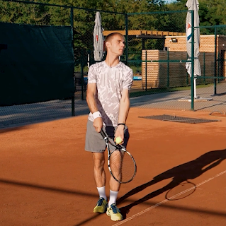
| Grab from the clip |
I was really tempted to go for clean lines again, but then I was like well my last clip was clean lines so why would I entertain doing the same? Or the same right away, anyway? I appreciate going back to a style you love (it’s the done thing in art, right?) and I do this myself often, too, but I’ve got a short film coming up which I’m animating all in one style, so I decided that this period leading up to that will be a time where I can free myself up a little and experiment. You know, get all this stuff out of my system now, before I can’t change my style for several months whilst animating my short!
So, looking through my work, I was thinking what haven’t I done much of? And what would I like to try or develop more? I really liked my first Callipeg animation in how loose/ scribbly it was, so decided to take that one step further.
I decided to use similar sketchy outlines, though this time used the brush rather than pencil tool, so there was a hard edge to my lines rather than a textured one. I then filled in both the shadows (the cast shadow and the one sweeping across his body) in the same scribbly way. Now, here’s where I almost gave in to temptation- I thought, well you know, I’ve experimented quite a lot already, now can I just play it safe and fill the inside of the figure cleanly?
 |
| Scribbly outlines |
Here, I almost cracked. I then decided that no, I’ve set out to make something different, so I’m going to make something different. I got mega stubborn on myself and decided to colour him in by the same scribbly manner. Kind of creating a lino print/ wood cut effect (a style I have wanted to emulate for a time now). All along I was worried that it might not look very good, but I guess that if I didn’t like the effect it was creating, I could just fill in the gaps I was leaving out and have a plainly coloured figure or just learn from this mistake and not do a clip in this style again. Not everything I do needs to be ‘great’ or I’ll never learn new things if I don’t try them. Also, not everything I make needs to go on social media/ YouTube (and trust me, it doesn’t)!
I finished colouring his clothing and was liking the result, but still pretty timid as it was my first time doing a full piece like this. I thought that for the skin, I’ll just fill it in plainly (just to add some differentiation I told myself). Then, I pushed through (I’m like wayyyy over dramatising this)! …and decided I was to do the skin in the same way- again, telling myself I could always colour it in fully if I didn’t like it.
Did I need to do any of that? Nope. I absolutely loved the end result and think that if I did colour any of it solidly, then it would have been a weaker piece. I think the moral of this story is to just go for it and experiment where you can, as you might like the result and if not, it doesn’t matter. Or something like that.
Once completed in Callipeg, I exported the file to TVPaint where I was to finish colouring it. I then went a little further. Why not make him a silhouette? Why not use bold and inverted colours? So I did just that and ended up liking the result even more. It also really accentuated the print style which I was going for. Win.
Then, the background- I almost just left it as a plain colour red, but my previous piece didn’t have a background, so I thought maybe I should do one for this. It might even strengthen it. I opened Procreate and messed about for a couple of hours and created a background I really liked and which further enhanced the lino/ woodcut style I was going for.
A background I discarded

The background I went for

No comments:
Post a Comment