Words about animation, photography, art, creativity, football + occasional ramblings from other life stuff • See my work here: floramartyr.com • Contact email: dotdotdashdotuk@yahoo.com • Hyperlinks in RED
Up until a week or so ago, I've not really been taking my camera out on my daily 'socially distanced' walks. I suppose this is because I feel fairly uninspired when walking similar routes each day, in places I somewhat feel overfamiliar with and have photographed time and time again. As I'm sure you know, I also am really passionate about shooting football and shots of my city somehow didn't seem to be cutting it for me. At least not then. I took it out one day to try and get some nice images of the floodlights at Deepdale Stadium (Preston North End) and actually really enjoyed being out with my camera again. Yes, it wasn't the same as photographing a ground or game, but it was just as enjoyable in a different way. And yes, it did take something football related to get me started- don't judge!
I then decided to take it on future walks and despite me originally feeling taking shots around Preston was something I didn't want to engage it, I actually got a lot out of my trips. I have always loved the variety of architecture in Preston and what better time to really get my camera to know it when there is next to no one around the town centre? I often feel self conscious taking photographs of buildings (I know I shouldn't, but I still do), because sometimes I feel I get strange looks (in reality I probably don't) and even had comments before along the lines of 'what you taking a picture of that for'? I think the more I'm out and about with my camera taking photographs of the things I enjoy, the more this self consciousness will fade away. I hope.
I also find that to extend my photography to taking images of things other than football, will strengthen my overall photographic skills and make me an all round better photographer. Alongside images of architecture, I have been taking some imagery of 'the current times', in terms of signs, social distancing measures and rainbows. I don't often share these on my social media, but take these as some sort of record of this time in our lives. Personally, I find this a quite important thing to do and could be really interesting to look back on in the future.
I too have succumbed to photographing the recent blossom. In these times it's so easy to fall down the negativity route, therefore I find it essential to focus some energy and appreciation towards the positives, however small.
As promised/ threatened in my previous post, I stated I would go into more depth about the character style tests I was working on. I have now completed (well, mostly: more on that later) all four tests. Some of the results I am pleased with, while some not so, though all of which I will expand on. I wrote about test #1 in the last post, so I won't dwell on that one in too much detail, but I will say that it still stands out as one of my favourites.
I absolutely love the thick outline and that the whole animation comes across really loose and natural. This is opposite to the realistic style I often work in and it goes to show that if you push your comfort zones, you might surprise yourself and come across something you end up really, really liking. I feel this will be a strong contender for use in the final film. Test #2 was the least inspired of the four. I used the same style outline which I do in a lot of my work, but for some reason a bit thicker, too?! I was mostly playing with the idea about facial recognition and decided to draw lines across the face, instead of having an actual human face. I still like the concept of what I was going for and there is probably room for further exploration here, but the execution of this piece was not it...
Test #3 was, like the first one, all about loosening up again. Moving away from the 'norm' and really trying to push out into something fresh. This was in terms of both the outline and the colour style. I used the charcoal brush for the outline and repeated the lines a couple of times to emphasise the rough edges. Because the outline was fairly jagged, I decided to colour it in, in one block forcing the focus and attention to the outline. It also really plays well with a film about memory, because it is just going for the shape and basic features of the person, rather than adding unnecessary detail in colour. You might not always remember specifics when recalling a memory, but will usually remember who was there and the basics of their actions.
Lastly, test #4. This one I decided to go all out. How very brave of me! I used a different outline in the way of the airbrush and filled in the character using a textured custom brush. I didn't think the fill was working and it was taking absolutely ages, so decided to colour half of it to give a general impression/ proof of concept. I didn't think it especially meant anything either- or at least not in the context of this new film, so it felt slightly pointless carrying on colouring it, so decided to move onto something else productive instead.
I think I had always wanted to try colouring my work in a different manner, rather than just using the fill tool with no texture or thought, though I feel there are much better (and less time consuming) ways of adding texture to a block of colour. One of these ways could be overlaying a texture in After Effects, once you have completed the standard block colour in TV Paint. I have tried this before and it tends to give a satisfying outcome.
Besides the colouring of the piece, the outline was something I thought might not work that well, but actually appeared fine once completed. I'm not sure whether it would work for this film, but I know I now have it as an option for future projects which might need a more rugged outline.
I decided to leave the faces off all because a) it's for a project about memory and b) to save time: it was to try out styles as a whole, rather than a detailed character account of each. Overall, I thought completing the task was good for my progression and development in terms of styles. It has opened up my mind to trying new ideas and confirmed whether some styles which I have had in the back of mind to try worked or not. It still frustrates me that they don't all look particularly aesthetically pleasing, but that wasn't the idea of the exercise. I wanted to try new things and forced myself to do so, even though I felt tempted at times to just revert back to what I know. Without sounding at risk for being over dramatic, I am a stronger person (or at least in my craft) for completing this. Here's to experimentation and eschewing comfort zones.
A few friends and I are currently in the process of creating a short animation. We are in the early development stages, from synopsis to logistics to visual style. As the lead animator, the latter is what I have been focussing on. I want this film to be the best I have been involved in to date and really want to put a lot of effort and time into developing it, leading to an end result we as a team are proud of.
I have completed a short test piece as proof of concept in terms of visual style (image below), though wanted to delve a little deeper into character design and development. I sometimes have the tendency to revert back to 'default' when drawing my characters in my films and produce them in a fairly standard realistic style.
The aim of these tests were to push me away from that and move in a direction new. I roughed out a few design ideas in my sketchbook and decided to go for the one which seemed most appealing first: bold lines. This one felt fun, flowing and not very restrictive. All good stuff. The result created something really lively:
In fact, I loved the look of this so much that I decided this style would make up the whole of another short film I'm making (I'm a busy person). I have only just finished the first shot (around three seconds) of a total ninety seconds run time. As it is still in its early stages, I won't be sharing too much about it at this time and you know, being a creative genius like myself, I'm very aware that there are people out there stealing my ideas. Always ready to pounce on this blog and see what I'm working on and the like..! Anyway, here is a screen grab of the outcome:
I aim to complete four character tests by Monday 20th April, so expect an in depth analysis of the outcomes sometime after that date... Until then, keep safe and wash those hands xo
Well being as cross stitch is all of a sudden my main new hobby, it's only right that I track my progress on this blog, right?! Since completing the animated horse cross stitch and another quite well developed design (see below), I'm now feeling a little more confident in my ability with these, especially in terms of making my own designs, through to execution. I like to think I know more about what looks 'good' (and what doesn't) on a design.
After completing the one above, I really wanted to develop it a little in terms of creating something in a similar light, but using a more challenging design. This would also make the final outcome less 'basic' and provide me with new challenges along the way. I do like a challenge! What I really liked in the one above was using the full square and the bright colours. These were things I wanted to bring forward into my next project. Tbh I only used the full square to cover up some wrong markings I made for a previous project, but I like it and who needs to know anyway?!
I was doing my usual Google image and Instagram searches for some inspiration to see what sorts of things other people were cross stitching and yep, people are basically cross stitching everything! No help there then... Well it kind of was, as I was then sort of overloaded with inspiration and ideas. Yay! What I really liked though, was the use of patterns people had created behind designs and I wanted to have a go at that myself.
So, I made a repeatable pattern on Photoshop- yes I know you're meant to use illustrator for creating drawings, but Photoshop is basically bae to me so I use that and I don't even care:
The pattern did take some trial and error, but eventually I got there with a pattern that I felt would work for the effect I envisaged. I then created an elephant from this screen grab from an animation I made a while back:
⬇
And finally, I added the repeated pattern:
I didn't want to elephant on the final design to be a black silhouette, because I thought it might look a little too plain and simple, which I was really aiming *not* to go for in this design. Instead, I opted for three dark colours to repeat every five lines. I went with black, navy blue and a dark green colour which I'm not sure what the exact name of it is! In my opinion, using these stripes added a little more detail to something which wouldn't have been *that* exciting if it was just one colour.
With the pattern, I wanted it to contrast with the elephant as much as possible, so I used pinks, yellows, reds etc. Sewing the pattern was quite straightforward, though took a lot of time- these full 3x3 inch square ones take a substantial amount of time to create. I do like the size though: I feel they're quite manageable and can be completed across a couple of days, rather than something larger which might take a week or so to complete. It was difficult choosing colours, because I'm running out of a lot of my threads and needed enough of one colour to last the amount of squares needed to fill for the designated colour. It's hard to tell how much thread you need to complete one section just by looking at it, but the more of these I've been doing, I find it's getting a little easier to estimate. I need to get out more. Oh, wait... My thread box is also a hot crazy mess right now and it super needs sorting. I'd love to get one of those boxes which has separators or drawers in, so each colour of thread can have its own section, ideally labelled too with the number of thread colour. Anyway, being as nothing of those are 'essential' items, they will have to wait until this has passed and it's safe to acquire 'non essential' items again.
This cross stitch did achieve what I wanted it to in terms of creating something more complex. I would like to continue and develop on this going forward as I really liked the way it turned out and already have some inspiration and ideas in how to take it further. If anyone has any questions or suggestions then let me know in the comments!
So what else am I doing during lockdown? Following on from one of my recent posts, I said I was working on quite an ambitious cross stitch project. Well, here it is:
An Eadweard Muybridge Horse in Motion. Every frame hand stitched, taking between 1.5-2 hours each, along with creating the cross stitched patterns (another full days work at least). And then post production (scanning in, importing them into the project, tweaking the frames and so on). For just over 1 second of animation. Dedicated or mad? You decide. Maybe both.
I didn't test out how it would look with the patterns I made before starting the sewing, so for all I knew, it could have turned out looking terrible. Luckily, it turned out exactly how I wanted and couldn't have been happier with the result. I put a lot of work into creating it and I'm pleased it paid off. Now I just need to find a film festival which is accepting entries of films under 10 seconds!
As we all know these are strange and uncertain times and without football being played currently or in the near future, understandably people are at a loss, myself included. I do have plenty of other hobbies and interests to keep me going, but one thing which I was getting a lot of my enjoyment out of lately has been removed. Photographing and watching football has been a key part of my life in the last year or so and with a lot of events coming up which I had booked in to photograph now postponed, it all feels quite gloomy. Being as what is happening in the world right now is far greater and more important than football and the safety of everybody involved is paramount, I understand the need for the postponements. If honest, I would not even wish for the games to carry on in the midst of this crisis. Annoying as it may be, the more we all pull together and keep to the guidelines given, the sooner this shall pass and we will be watching the game again, looking unto it as even more beautiful than before.
To give myself a bit of a break from my animation, because of feeling uninspired and downhearted due to the gazillion rejections I've had with it recently, I decided to go to Hobbycraft and treat myself to something fun. This would be to take my mind off my work and provide a different type of creative outlet other than photography or animation. Sometimes it's refreshing to have a break and do something which is still creative/ productive, but with no pressure. So, I decided to buy a cross stitch kit. For a 3"x3" kit, you get a pattern, a piece of material, a needle and a selection of threads in the colours as per pattern. I chose a fairly simple beach hut one as it was vibrant and I love going to the seaside! There are loads to choose from. During 2012 when I was unwell, I did a lot of these cross stitches when in hospital, but I have not done one since. It felt a bit strange, but also pleasing to pick it back up again.
I really enjoyed making it and it was quite easy to get back into the swing of it. It's a really relaxing hobby actually, but does involve a fair bit of concentration. If you're not careful, you might lose count!
Anyway... once completing it, I thought, well why don't I do my own design next? So that's exactly what I decided to do!
I made a pattern for 16 aida count fabric of the above giraffe. Maybe you recognise it from an animation I made not so long ago?
The pattern took a while to produce, because it was a case of putting in each symbol separately. If anyone knows a quicker way, comment please!
Once the main pattern was complete, I added an outline (in blue, above). This was so the finished piece didn't look so 'pixelated'. I actually 'ad-libbed' the outline when I was sewing it, because some of the lines on the pattern would have seemed a little unnatural otherwise.
Finished outcome
Regarding the overall piece, I am pleased with it as it's an achievement in terms of what I have accomplished: a cross stitch from designing my own pattern through to completing it to a good standard. Despite this, as it's my first one, there are bound to be issues and I feel that there are some parts I would improve upon. I feel these will only get better with practise, which is why I have decided to embark on a really quite ambitious project for my next one... Watch this space for more!
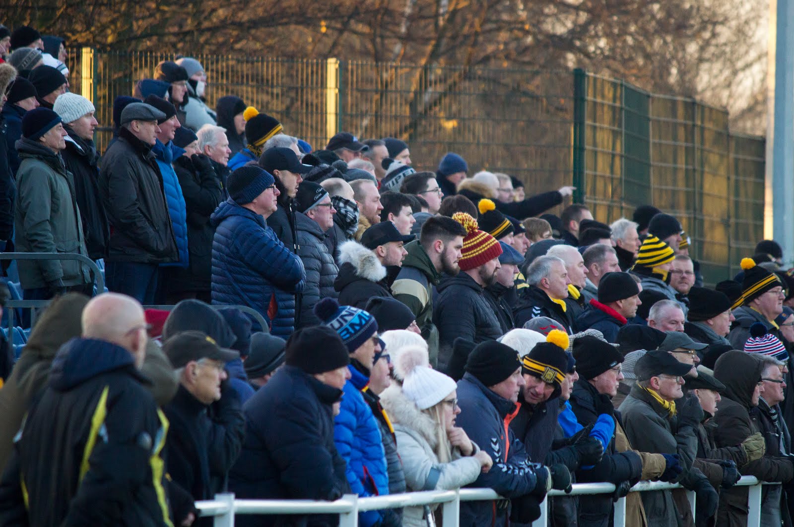
With my intended fixture for this round (Coventry v Spurs) moved to the Monday evening, it was time for 'plan B': Championship side Leicester City against WSL fourth placed Reading. Unfortunately, this didn't materialise either thanks to Storm Dennis, which we found out en route to the game. Being unable to make the rearranged midweek fixture, our only hope to see a game from the fifth round proper (last sixteen) was another trip to north London to watch the rescheduled Arsenal Women FC vs Lewes FC Women at Meadow Park (home of Boreham Wood FC). The things we do for the love of the game, eh?!
Whilst Arsenal are the most successful top flight English women's side to date, having won more trophies and titles than any other, Lewes have their own unique story. In 2017, Lewes launched their EqualityFC campaign, which saw the Lewes Women players being paid the same as their male counterparts. At the time of writing, they are the only club in the world to be doing so. Lets hope it's not long before more clubs start to follow suit. Having visited The Dripping Pan in November last year for a women's game, it was a fantastically positive match day experience, with a great atmosphere and attendance. I would highly recommend a visit if you are yet to do so. They are a really progressive club.
The Dripping Pan
Despite it being raining on the drive down, by the time we arrived at Borehamwood it had cleared up. Cleared up even so that the yellow object was visible in the sky. I don't mean my photo vest (or hat, for that matter):
Meadow Park is a four sided affair, with two distinct looking stands (one seated along one touchline, one standing at one goal end), another large seated stand (which was almost full by the time the match was underway) and some uncovered more traditional looking terracing at the other one of the ends. This was where the Lewes supporters situated themselves for the first half. The most poignant feature beyond the realms of the ground was the singular tower block behind the main stand. Pollok anyone?!
This game was the designated Heads Up game, encouraging supporters to #KickOffAConversation about mental health. You can read more about the important campaign here. Both teams wore Heads Up t-shirts whilst warming up.
The last time Arsenal and Lewes met was a nil-nine thrashing. Were we going to see a repeat in this game? Perhaps not... Ninth placed championship side Lewes were able to prevent third placed WSL side Arsenal from scoring until the second half. Despite Arsenal obtaining the majority of possession, they were unable to break through Lewes's strong line of defence until the fifty-fourth minute. Indirectly assisted by Danielle Van de Donk, it was Caitlin Foord who knocked in the rebound, scoring on her debut outing for the Gunners. A promising start for the Australian international.
Van de Donk did end up getting her moment too in the eighty-fourth minute, doubling the host's lead. It was almost always going to go Arsenal's way, though I was impressed by the performance Lewes put in. I'm sure the 1,663 spectators would share similar feelings and hopefully found the match a great afternoon's entertainment. Lewes bow out of the cup in the best possible fashion.
Arsenal will take on Spurs (again at home) in their quarter final match on the 15th March. The ties in full are here, with one yet to be decided:
I'm assuming how you've got to this blog post is through my social media, therefore you may have seen me post various animated skate clips of late. This is a post about those. I used to skateboard in my teens and I still really like the culture and aesthetics surrounding skateboarding, despite not having ridden a board in around ten years. In 2011 I shot a skate video of one of my talented skater friends Fred Simmons and I still have the footage from that video. I've been animating a lot of either animals or hands recently, so I was trying to look for something I could animate which would look great rotoscoped, but also something aside from what I have done lately. Digging deep on my computer I found the skate clips, which proved perfect for my animating needs. My intentions for the animations were to create something which was looser and more flowing than my usual moderately fixed outline pieces. This was for a number of reasons: • Force me out of my comfort zone by trying different styles • Diversify my portfolio The first piece (below) I tried a super loose style on the outline of the figure. As you can see, I used a brush tool at varying thickness, re-drawing over each line roughly, building up a layered messy effect. I also drew 'random' lines elsewhere on some of the frames, to exaggerate the inaccuracies of the drawing. To fill out the figure, I used what TV Paint calls the Chinese Brush, which has a lot of texture to it. I was purposely inaccurate about applying it: not being afraid to leave gaps or go outside the lines. The more of that, the better. The background was a blurred out version of some analogue painted frames I did some time ago. I toyed with using a plain coloured, non moving background, though it didn't fit as well as this one did. This did take some trial and error, especially in terms of getting the colour 'right' or at least right for this particular video.
The second one was a direct development from the previous one. I loved the loose outline, though to make it differ, I used a thick marker-like brush, varying in weight. I also drew around the figure using one line, rather than the build up of lines in the previous piece. I liked the use of the shadow in the last one, so continued its usage into this one. I've never really used a shadow before, though I enjoyed the look it created, so I think it will be something I take into further work. It does make the whole piece take longer to produce, though I think the overall outcome makes it worth it.
I also like what I did regarding the bar he skates on: where it appears as he uses it and disappears when he doesn't. This is a technique I think would integrate well within other aspects of my rotoscope work, skate related or other.
After having completed two animations where the inspiration came fairly naturally/ instantly, the third one (below) took some time to develop and finish to a clip which I was happy with. I felt I had somewhat used up all of the 'good' styles and it became difficult to find a style which was equally as loose, without being *too* repetitive or similar to the other two. A hard task.
I left it a while after drawing the outlines and colouring the fill, to allow for more inspiration and thoughts to creep in. I eventually thought back to some previous animations I had carried out using paint and pulled upon the ideas from those:
I feel it's a fitting continuation, as in no way was I ready to 'park' those ideas or techniques. The red painted squares made for a really textured and bright background, a simple and effective technique in my opinion. It contrasts well with the black and the greys of the skater, whilst satisfying my visual style and processes.
So, did I fulfil my two aims as stated earlier in this post? In regard to forcing me out of my comfort zone and usual styles, all three of these pieces did. They don't have the clean look a lot of my work displays and I feel my portfolio is stronger and more diverse for it. This fulfils my second aim, as I plan on including at least one of them when I compile my next showreel.
From having completed these three pieces, I don't want this to be the end of me experimenting with different styles and reverting back to what I feel 'safe' with when creating new work. The idea behind these was to help me move to new techniques and I hope to carry this fluidity into future projects.
I have always had an interest in photography, or even just cameras. I remember when I was a child, my dad had a draw in his filing cabinet full of his old film SLRs and I thought they were really exciting. At least to look at: I never dared ask to use one! It wasn't until 2010 where I got one of my own: a second hand manual Praktica from eBay:
This was off the back of me using a compact digital camera beforehand- remember those?! I loved taking photos on my compact and I think I had a good eye for composition (background is in fine art), though my output wasn't giving me the 'look' I had seen everywhere and what I wanted to achieve.
Taken on my Nikon compact
The 35mm SLR was fantastic, but a very cumbersome and heavy object. It was also costly to run and didn't have a filming capacity either, which is what I needed at the time to improve my moving image output. After all, I was studying Film Production and didn't want to rely on the equipment the university provided, especially if I wanted to progress outside of university time. I also really wanted a camera which could 'make the background blurry'. Bokeh, as I now know what it is called.So yep, I cracked and bought a Canon 550d. This is still the camera I use today, maybe that is surprising. I have upgraded from the kit lens, mind!
Above and below: images taken on my Praktica, 2012
I used to use my DSLR a fair amount, but never had a specific focus or style- I think I was just trying to take photographs which looked 'nice', it didn't matter what of. As it wasn't a subject I was studying at university or my main medium to work in, I didn't ever see it as something I could take seriously, though obviously that isn't (or shouldn't be) the case.
Despite enjoying it to take photos with, I sort of left it mainly for shooting video, as that was really why I bought it. After selling my Praktica film SLR due to its bulk and weight, In 2016 I bought an automatic 35mm Olympus Trip, which was lighter and easier to use. In 2017 I sporadically started what now is clearly my main hobby: groundhopping, though without realising it at the time. I brought my Olympus along to the games, because I didn't like taking photos on my phone, but still wanted to take images. Below are some of the ones I took on that camera:
Looking back at the images I took around that time, I had built the foundations of what I create now, though the standard and compositions of the imagery is less considered. It was only until the latter half of 2018 when I decided to take my DSLR to the football, but even then I had no idea what I was doing. I was still new to watching football at the time. I didn't know whether I wanted to take action shots, pictures of stands, of spectators and I had no reference points or inspiration. I must have enjoyed it though- perhaps I saw it as a challenge(?), as I persisted with taking it along to games. It was probably more-so to keep me distracted from the cold!
I had also stopped drinking completely by this point, so time spent in pubs and photographing portraits of friends and local musicians became less frequent. This used to be largely what I took images of between 2014-16. I obviously needed something to fill that hole and another creative outlet. I even bought a zoom lens so I could attempt action shots, too. I quickly developed my style and attention towards stands, spectators, landscapes and quirks around the grounds. This was with some action shots and gameplay included, creating a 'story' or 'essay' if you like, taking in all aspects of the match day experience. This direction came after plenty of trial and error, having attended many games without exactly knowing what I was doing with my camera. I sometimes look back at the grounds I attended back then where I didn't fully take advantage of any photo opportunities which I would be 'all over' now. I also look back on it in a positive way, in the fact that if I didn't take my camera to games early on, then I might not have progressed at the speed or indeed in the style that I have. I really relish in the fact that now my photography has a direction and because of that, it makes it all the more enjoyable, rather than 'just taking pictures'. That is fine, too if that suits you, but this is giving me something I wholly enjoy and thrive in, while building an archive of non league grounds and women's football matches.